The Colourful World of Textile Designer Susan Deliss
With a touch of subtlety and surprise, interior decorator Susan Deliss uses colour to add depth and character to her designs.
- Text by J.H. White
- Photography by Andrew Steel
About Susan Deliss
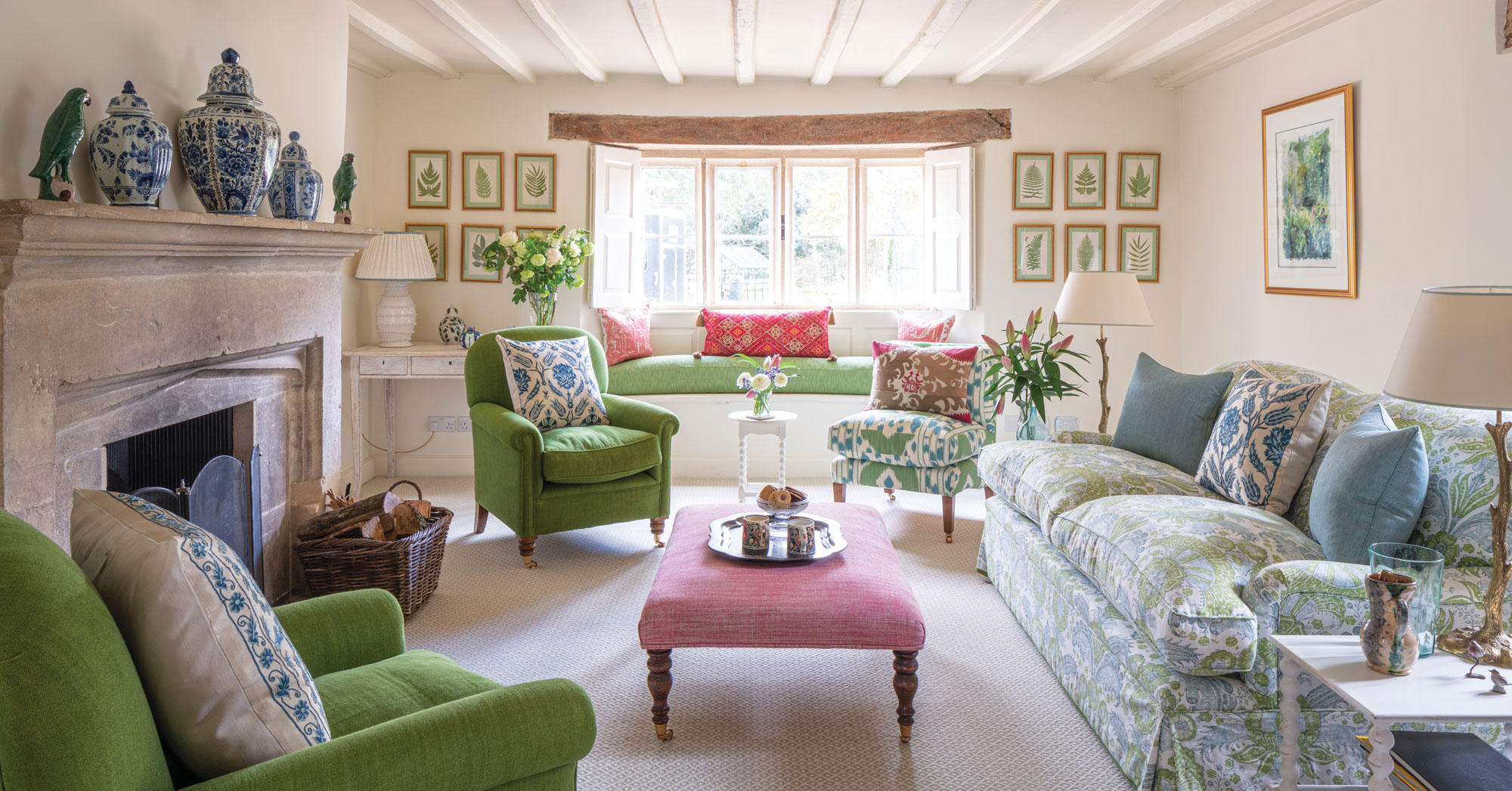
Textile designer and interior decorator Susan Deliss is known internationally for her sophisticated and nuanced use of colour and pattern. Describing her work as “intuitive and thorough,” Deliss designs vibrant fabrics and braids for a range of home decor items at her Notting Hill studio, while also designing homes and spaces for clients in the UK, the US, and the Middle East.
Deliss’s work is celebrated not only for being aesthetically beautiful but also for reflecting the personalities of her clients. In this exclusive interview, she shares how her novel and layered approach to colour and design enables her to bring her clients’ dream spaces to life.

A well-designed space is like a beautiful symphony
When launching a new project, Deliss prepares a list of four or five keywords that sum up the desired style and goes on to create a palette of colours and designs based on them.

For instance, one of her clients wanted a certain “Englishness and bohemianism” for his Georgian English country house. “I interpreted ‘Englishness’ to mean smaller scale, pretty, and witty. At the same time, he wanted me to inject a sense of adventure, which I did through playful hints and details throughout the house. As an example, one of the wallpapers I used looked like a simple wallpaper, but if you look closely at it there were unicorns on it. I believe that each room needs to have its own character so that there’s a sense of wonder as you walk through the home. So I injected some witty surprises here and there,” Deliss says.

The importance of colour
There’s an art and skill to colour selection. “Picking the right colours is not simply a task, but an all-important process that needs to be thought through. Before I make these decisions, I first find out the atmosphere of the house to make sure the palette is cohesive,” Deliss says.
She learned the importance of this process, in part, by watching her husband, a restorer of paintings now working for the Getty Museum and the Louvre. “I learned a lot about the specificity of colour by observing him mix tiny tones of colour: sitting there, doing minute dots, and then getting back to his palette and mixing another colour. Similarly, I’m creating a palette with that level of refinement of colour and pixelation.”

The art of subtlety
Deliss advises people looking to redecorate their homes to avoid overly bright colours and clashing shades. “It’s like having somebody very loud at a party. They can be the life of the party, but it also means that nobody else can speak. You shouldn’t be afraid of colour, even strong colours, but if you do decide to take that route you should make sure it still complements the other shades and items in the room,” she says.
“In some instances, subtle shades work best. In the case of an old property, I chose not to use bright, new colours and instead opted for muted shades. The result was a soft aesthetic that many people found rather enchanting.”
Complementing over coordinating
While stark contrasts and intense hues are not Deliss’s style, keeping it overly safe and borderline dull isn’t either. She advises to ‘tone’ colours, not match them.

“Toning is choosing colours that complement each other. I once worked on a home owned by an American in England where there were a dozen shades of green, about eight shades of blue, and many different pinks in a room. If they all matched, the whole thing would be hideous. In that case, I used pockets and accents of colour.”
“If I choose a strong colour, then I’ll use accents of a pattern. But I don’t use huge amounts of pattern and a huge amount of colour—something has to give. Instead, I layer colours, and even fabrics and textiles, to give it visual depth,” Deliss says.
Distinct approach
Deliss doesn’t follow trends in her design work. “I don’t follow what’s mainstream. I don’t want things to look like they’re mass-produced. I value individuality and craftsmanship,” she says. But she may inadvertently initiate trends herself. “I used a particular shade of green to paint the flat of writer Edward Bulmer. I was one of the very first people to use it; now many people are using it.”
Inspired for a Beautiful Life
Related Articles
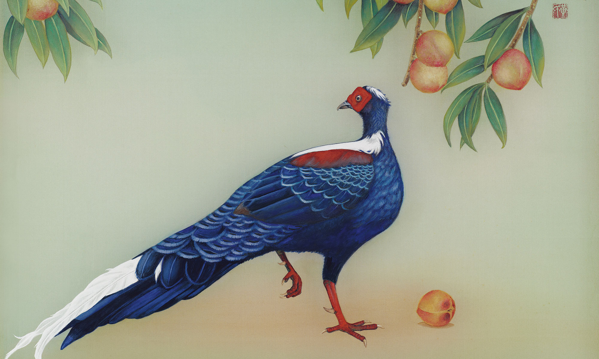
Jeweled Canvas of Glue-Colour Paintings
Taiwanese artist Huang Hung-chi infuses Western realism techniques with Eastern aesthetics in his glue-colour paintings.

Discover Goddess Within
Eden Zhu grew up in China but only after coming to the United States did she grasp the deeper meanings hidden within Chinese culture.

